Color isn’t just decoration — it’s strategic communication. Whether it’s the bold red of Coca-Cola or the calming blue of IBM, color influences how we feel, think, and ultimately buy. In fact, research shows that up to 85% of purchasing decisions are influenced by color alone. Yet, many businesses overlook this subtle but powerful psychological driver in their marketing strategies.
Walk into a fast-food restaurant and you’ll likely see red and yellow – colors that stimulate hunger and speed. Step into a luxury boutique, and the palette shifts to black, gold, or white – signaling exclusivity and prestige. These choices are far from random. They’re calculated strategies rooted in color psychology, a science that explores how hues affect perception, emotion, and behavior.
In this guide, we’ll explore the psychological principles behind color in marketing, supported by behavioral studies and real-world brand examples. You’ll learn how to use color strategically to create emotional resonance, build a strong brand identity, and drive consumer action
What Is Color Psychology?
Color psychology is the study of how colors influence human emotions, thoughts, and behaviors. Different colors evoke unique feelings and associations that shape how people perceive brands and products. These reactions come from a mix of biology, culture, and personal experience, making color a powerful visual stimulus that affects our daily decisions.
By understanding color psychology, businesses can tap into these subconscious responses to create stronger connections with their audience. For example, red can evoke excitement or urgency, while blue often builds trust and calmness. Knowing these effects helps brands design visuals that communicate their values and personality more effectively. This is why color psychology is a crucial part of any successful marketing strategy.
How Color Psychology Affects Branding and Marketing Strategies

Color psychology is a powerful tool for shaping how customers perceive your brand and guiding their behavior. Our emotions strongly influence the choices we make—and color is one of the most effective ways to evoke specific feelings in the minds and hearts of your audience. In fact, up to 90% of an initial impression is based on color alone. Visuals play a crucial role in purchasing decisions, with 93% of consumers making choices based on what they see. Moreover, color can boost brand awareness and recognition by as much as 80%.
Research also shows that up to 85% of customers cite color as a primary reason for choosing one brand over another. This means that color should be a key consideration in everything from your logo design and brand aesthetics to your overall experience across all marketing channels.
While individual responses to color can vary due to factors like culture, gender, personal experience, and even neurological differences, there are well-established patterns proven by countless studies in color psychology. For example, red may evoke passion or urgency, while blue often conveys calm and trust. But what about less typical brand colors like orange or gray? And what emotions do they stir—such as hope, harmony, or sophistication? Understanding these subtle nuances helps you craft a brand story that truly resonates with your target audience.
Since color is one of the most fundamental visual cues in human perception, mastering its psychology is essential to creating memorable and impactful branding.
Emotional Impact of Color: A Case Study in Food Branding
Before we dive into individual colors, it’s worth highlighting a real-world study on how colors in food and beverage branding shape consumer emotions. A comprehensive study titled “Color and Sentiment: A Study of Emotion-Based Color Palettes in Marketing (arxiv.org) examined how color usage in branding influences consumer emotions, particularly within the food and beverage industry.
Researchers analyzed the dominant colors in the logos of 644 food and beverage companies using k-means clustering to identify distinct color palettes. They then correlated these palettes with over 30,000 customer reviews from Google Maps, categorizing emotional responses into five primary emotions: happiness, anger, sadness, fear, and surprise.
Key findings from the study include:
- Yellow and Happiness: brands featuring yellow prominently in their logos were strongly associated with feelings of happiness. This aligns with yellow’s general perception as a cheerful and attention-grabbing color, making it effective for brands aiming to evoke positivity.
- Blue and Sadness: conversely, brands with dominant blue hues were more frequently linked to feelings of sadness. While blue is often associated with trust and reliability, in the context of food branding, it may evoke a sense of melancholy or suppress appetite, as suggested by other studies.
- Red and Gray’s Versatility: interestingly, red and gray appeared across all emotional categories, indicating their versatile role in branding. Red, often linked to excitement and appetite stimulation, and gray, associated with neutrality and balance, can elicit a range of emotional responses depending on their application.
The study’s methodology initially involved a fuzzy sets approach to determine the intensity of emotional responses, categorizing them into four levels: Low, Medium, Strong, and Very Strong. Researchers merged the color palettes of companies with similar emotional responses. This helped them identify unique palettes for each emotional category.
These insights, therefore, underscore the critical role of color in shaping consumer perceptions and emotional responses. For marketers in the food and beverage industry, strategically selecting brand colors can be a powerful tool to evoke desired emotions and influence purchasing behavior.
Moreover, this case study is especially valuable for marketers seeking data-backed insights and a deeper understanding of color psychology. It doesn’t rely on assumptions or design trends—it connects real customer emotions with real brand colors, providing actionable insights for emotional branding.
Color Psychology Breakdowns
Blue
Here’s what different brand colors can communicate — both positively and negatively.
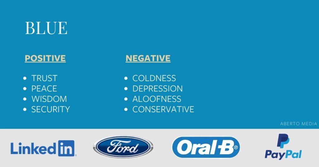
Blue is universally recognized as a color that conveys trust, loyalty, and dependability. It exudes a calm, logical energy that fosters feelings of security and serenity. Often associated with stability and wisdom, blue has a personality that is loyal, respectful, and social. This color is the world’s favorite, preferred by a significant majority, which explains why it’s the most common choice for corporate logos. Blue is a favorite among social media giants like Facebook and Twitter, who want to project reliability and trustworthiness—key for businesses handling large amounts of personal data.
However, blue has dual meanings. While it reassures and calms, it can also feel cold, unapproachable, and emotionless. It’s rarely found in natural foods, which can make it seem unappetizing and suppress appetite. Brands like Blue Cross Blue Shield use blue strategically to communicate security and dependability, reassuring customers during important decisions involving health and data privacy.
Red
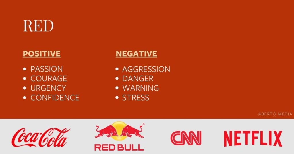
Red is an intense and dynamic color that conveys power, passion, energy, and excitement. It stimulates boldness and fearlessness, often used to provoke action or urgency. In marketing, red is famous for its ability to boost appetite and encourage impulse buying, making it a go-to for food and beverage brands. It also carries a daring, adventurous personality.
At the same time, red can evoke anger, danger, and warning. Its aggressive side manifests in traffic signals, emergency signs, and symbols of defiance or pain. The effectiveness of red in branding depends heavily on context and balance. Coca-Cola’s iconic red branding exemplifies how red can be harnessed positively to communicate joy, energy, and “real magic” to consumers.
Purple
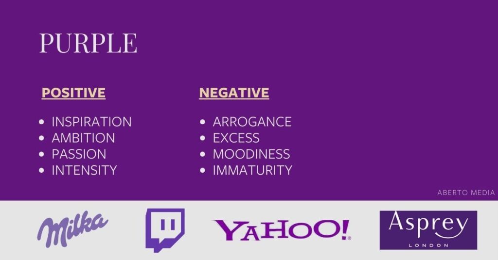
Purple is a color steeped in history and symbolism, representing wisdom, wealth, spirituality, and sophistication. It carries an aura of dignity and imagination, with a personality that is sensitive, dignified, and understanding. The royal connotations of purple date back to ancient times when it was a color reserved for emperors and nobility due to the rarity and expense of its dye. This regal heritage imbues purple with an immediate sense of luxury and superiority, making it ideal for brands that want to signal exclusivity or a high level of craftsmanship.
Yet purple also hints at reflection, decadence, and moodiness, so brands must carefully balance these qualities. Its feminine undertones are often leveraged to connect with female audiences, as seen with brands like Hallmark. The relative rarity of purple in branding means it helps companies stand out by conveying creativity and unique value.
Orange
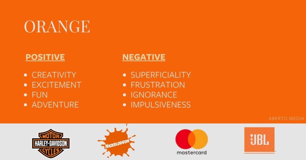
Orange is a vibrant color that symbolizes courage, confidence, warmth, and creativity. It conveys an adventurous and energetic spirit, making it popular for brands seeking to appear friendly, approachable, and playful. Orange radiates warmth akin to sunshine, stimulating excitement and social connection. Its lively personality makes it a favorite among non-corporate, youth-oriented brands.
On the downside, orange can sometimes be perceived as immature or frustrating, and some view it as a color of deprivation or sluggishness. Not everyone likes orange; a significant percentage rank it as their least favorite color. The spectrum between a luxury brand like Hermès and a fun, quirky brand like Nickelodeon highlights orange’s versatility. Nickelodeon’s iconic orange splat perfectly mirrors its bold, irreverent programming style.
Green
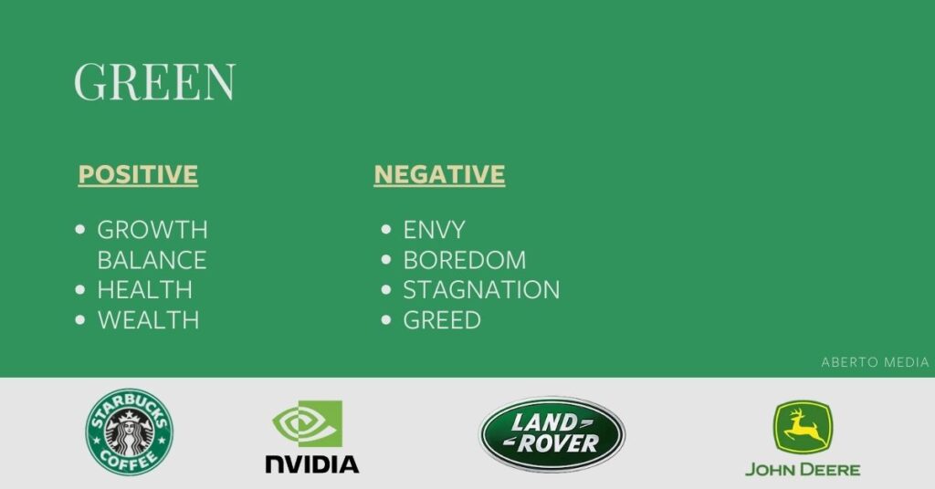
Green symbolizes life, health, growth, and prosperity. It is deeply connected to nature, evoking feelings of freshness, renewal, and balance. The color green often represents hope and stability, making it a favorite for brands focused on wellness, sustainability, and natural products. Green’s calming presence brings relaxation and reassurance.
However, green can also signify stagnation, envy, or dullness if overused or used inappropriately. Brands like Whole Foods Market capitalize on green’s healthful connotations to reinforce their commitment to fresh, high-quality products and an eco-friendly ethos.
Yellow
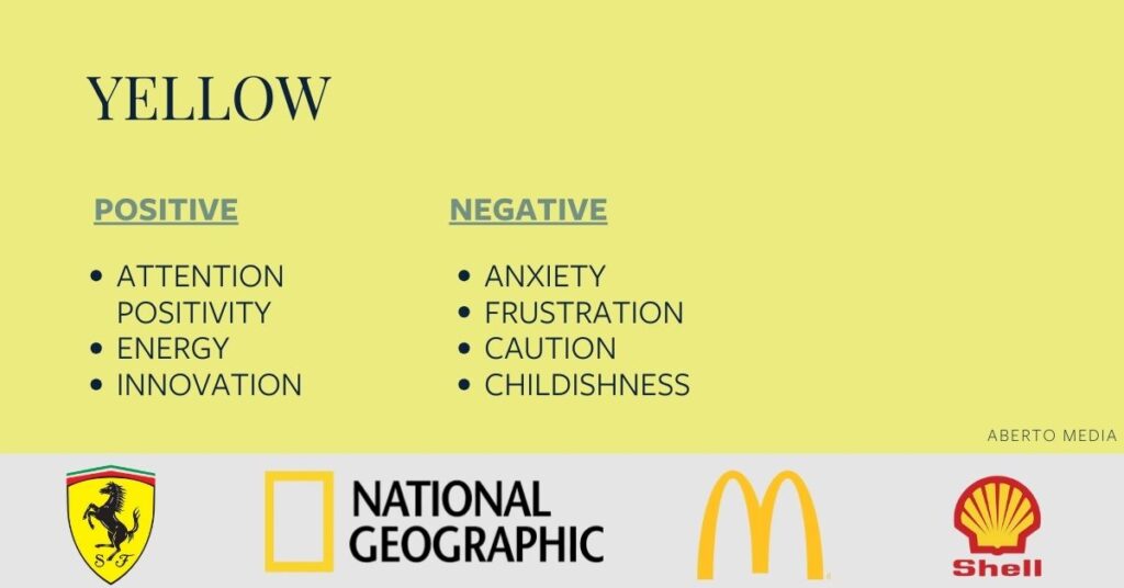
Yellow embodies optimism, warmth, happiness, intellect, and creativity. It is a youthful, energetic color that evokes sunshine, cheerfulness, and extroversion. Yellow is often used to attract attention and promote a sense of innovation and friendliness.
Yet, yellow also has its drawbacks. It can convey irrationality, fear, caution, and anxiety—hence its use in warning signs and traffic signals. The challenge is to use yellow in a way that maximizes positivity while avoiding feelings of unease. McDonald’s golden arches use yellow to foster a happy, approachable, and kid-friendly atmosphere, perfectly balancing its appetite-stimulating red counterpart.
Black
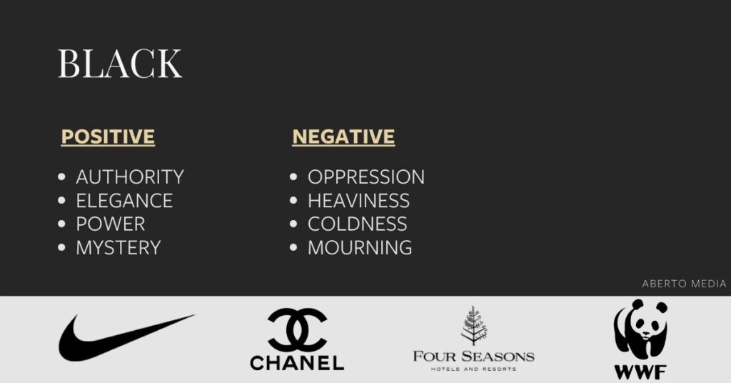
Black represents sophistication, power, elegance, and authority. It is a color that exudes confidence and decisiveness, often associated with luxury and high-end brands. Black’s sleekness can give brands a timeless and refined look, which is why it is prevalent in fashion and technology industries.
On the flip side, black may also convey oppression, menace, coldness, or mourning. It can evoke feelings of heaviness or evil in some contexts. Despite this, brands like Nike use black masterfully to emphasize strength, empowerment, and performance, creating a bold and serious brand identity.
White
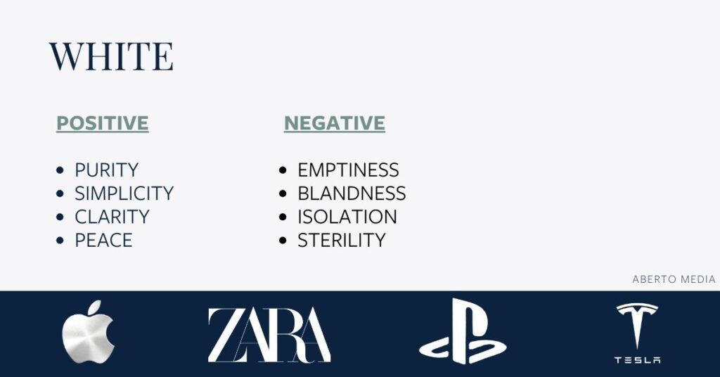
White signifies purity, innocence, cleanliness, and simplicity. It offers a minimalist and modern aesthetic that can help a brand feel fresh, open, and pristine. White’s neutrality allows it to pair well with other colors or stand alone as a symbol of clarity and sophistication.
However, white can sometimes feel sterile, empty, or cold, reminiscent of hospitals or blank spaces. The perception depends on how it’s applied within a brand’s overall visual identity. Brands such as Adidas use white to communicate simplicity and universality, creating a clean and approachable look that contrasts with more aggressive black-heavy branding.
Want to dive deeper?
If you’re curious to explore the full personality traits associated with each color, you can check out this detailed guide by Iconic Fox. It provides a visual in-depth breakdown of how each color connects with brand personality and emotional perception.
Need guidance on your brand colors? Learn how color psychology can help…
If this article got you thinking about your brand’s color palette, feel free to reach out!
Just fill out the short form in our Hire Us section— and under “Other,” mention that you’re interested in a free consultation about color strategy and branding. You’ll hear from us within 24 hours to schedule your free color strategy call.
Prefer a quick chat? Reach out to us on WhatsApp
Let’s make your brand colors work with you, not against you.